A Fresh Start
New Logo, New Name, Same Vision
Welcome to the new Food Roots, a complete rebrand of the Asian Pacific Islander Forward Movement initiative Roots Food Hub. It's been a long time coming, but we're happy to announce our new look.
We teamed up with the creatives at Giant Robot Media to develop our new brand image, language, and guidelines that will help define the Food Roots mission for the many years to come. Below is a quick walkthrough of our redesign.
The Logo
The daikon radish is one of the most used asian vegetables. Pickled, stir fried, steamed, boiled, you name it. Daikon is a widely used Asian veggie and is home to most Asian fridges. Daikon is also a root, which plays to the literal meaning of the name Food Roots. We went through several iterations with Giant Robot Media until we finally concluded on the last square.
The Typeface
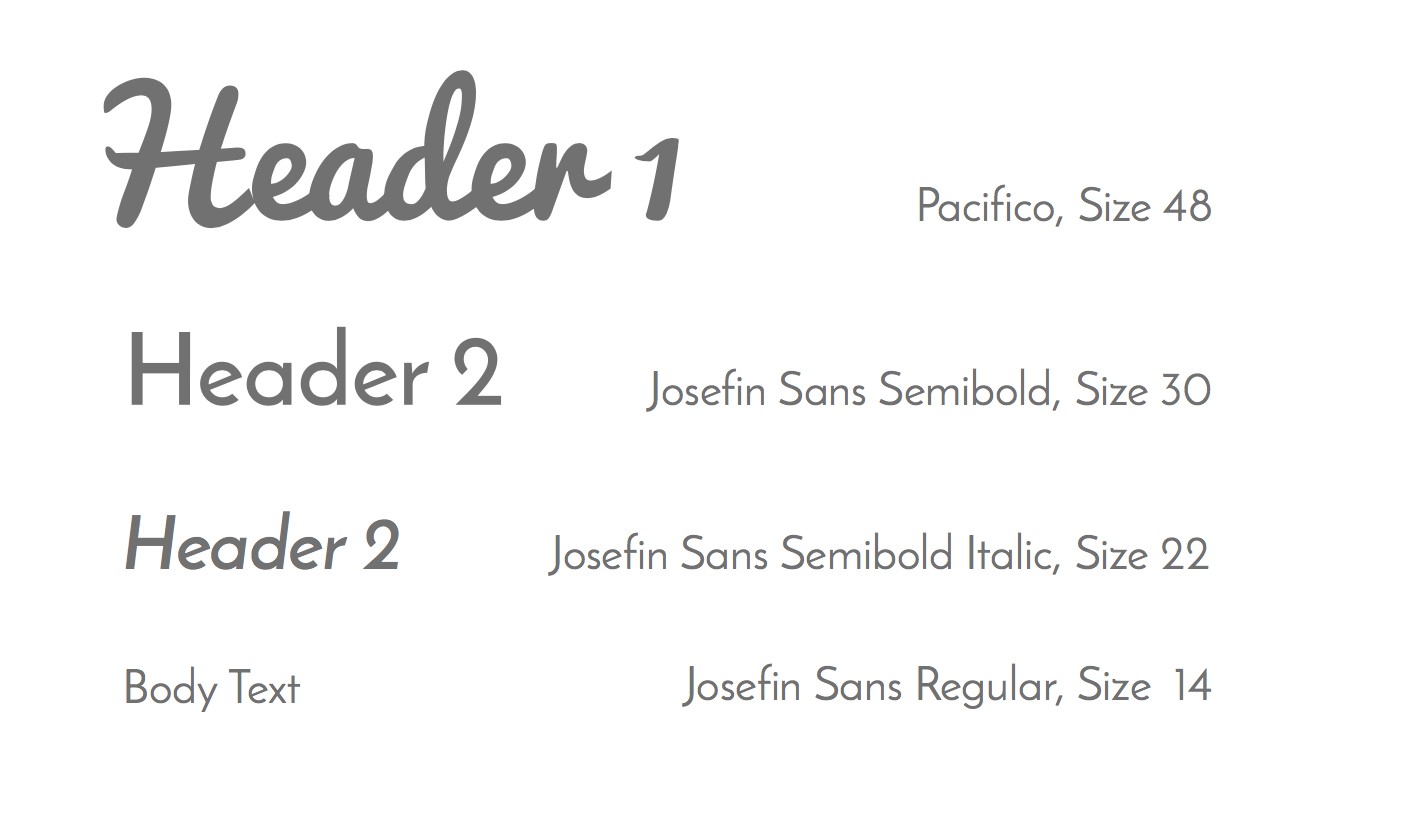
It’s important that text styles emulate the mission and values of a brand. Food Roots is all about sharing local produce with the community. The font “Pacifico” used in the logo has a retro handwritten feel, giving customers that same feeling of receiving produce grown by their local farmers. “Josefin Sans” is a sans font that pairs well with “Pacifico” and gives customers an easy font to read online and on print.
The Colors
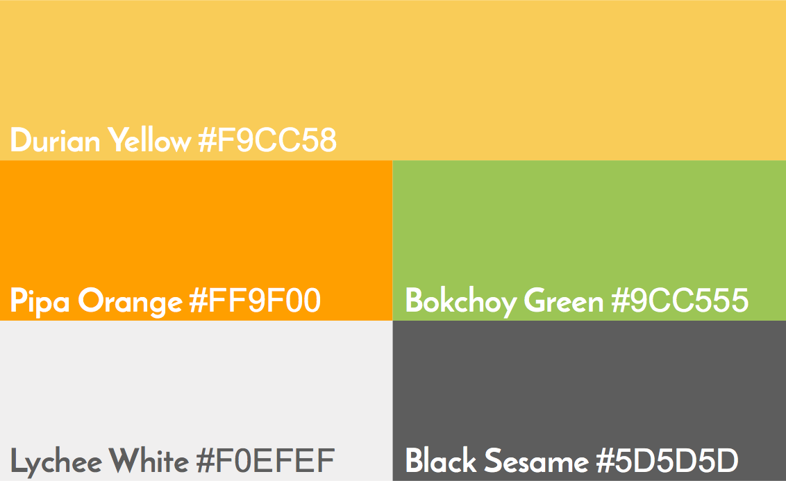
The color pallete for Food Roots plays on the natural colros we find in the garden. In addition the color pallete provides warmth, which echoes the brand value of family and community.

